Art I Like /1
Art I Like /1
I've been doing something new recently - collecting art. Here are some pieces I like and why.
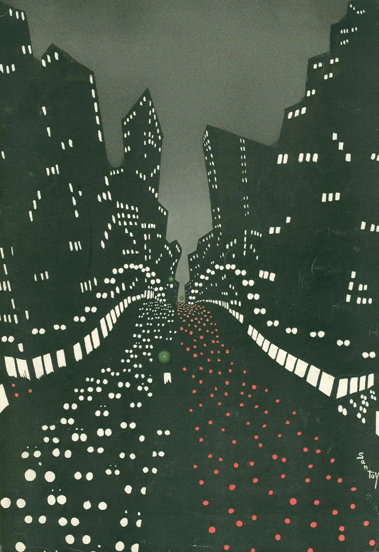
Left has an eerie feel to it. Buildings without defined edges. Rather monochrome colouring - a grayish green, opaque white light, reds. Interestingly a gradient sky, contrasting the rather constant shade of pale green. The windows give the only geometric priors to the scene.
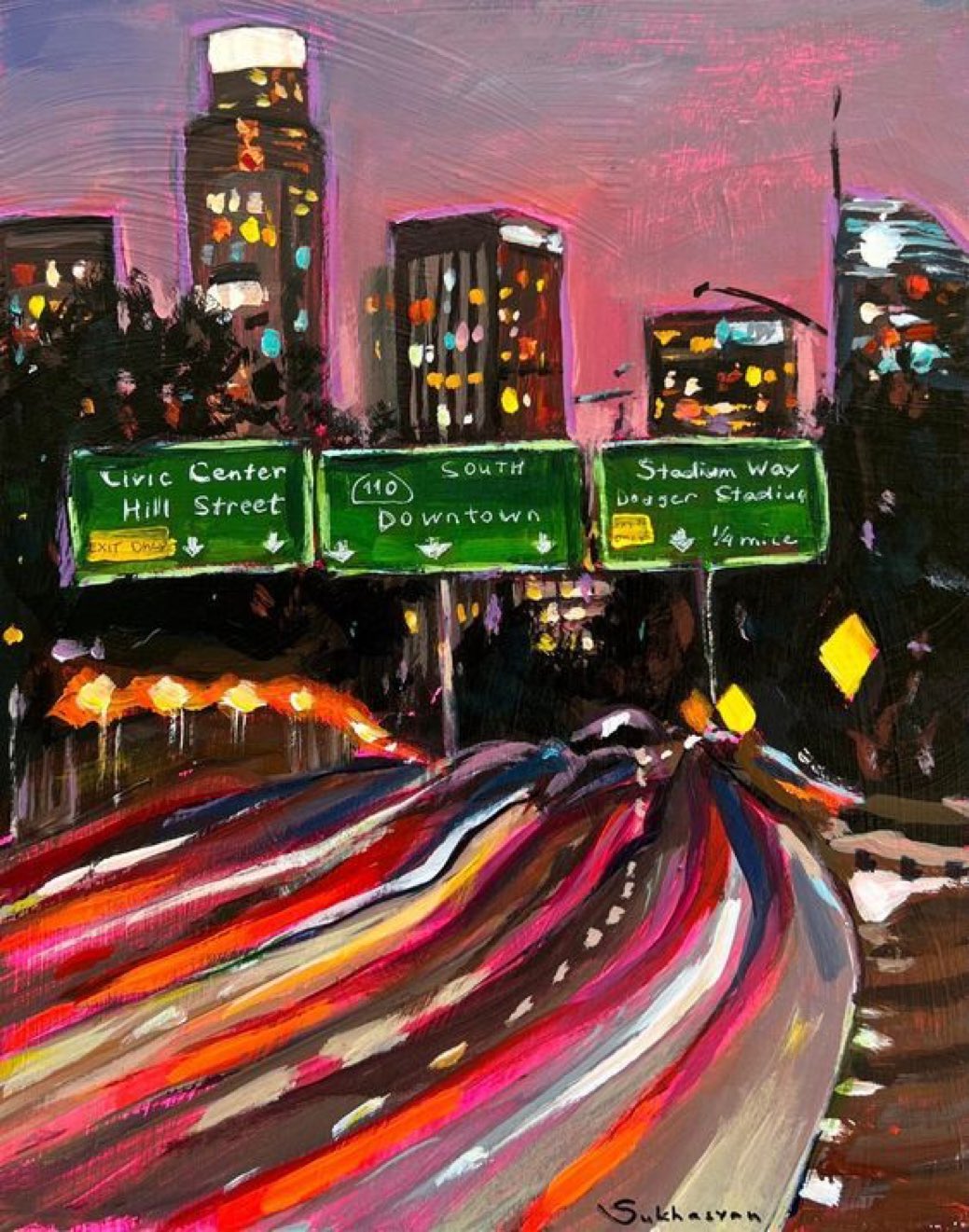
On the right, fluid, lively pinks and greens. The colours of life (or entropy). The same view of the roads, but instead of boxes and circles, everything is shaped as strokes.
Two very different renders of the same scene - city movement. To me, neither have a negative valence - both feel inherently neutral and warm. The dark green is a natural colour, as is dark red. That being said, there is still a dream-like quality - the rush where you can't remember the past state - hence City Night Fever.
fever. n. a temporary increase in body temperature
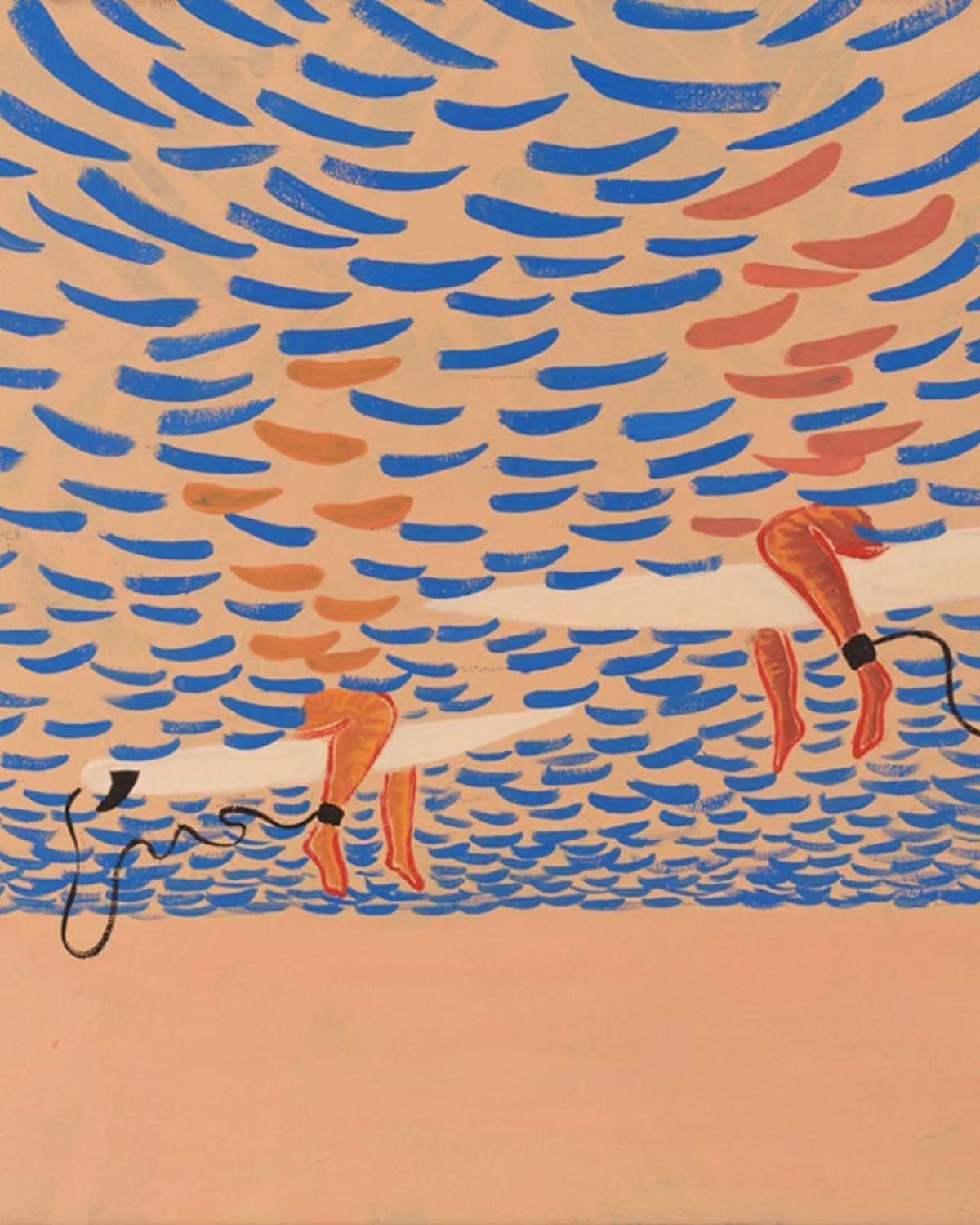
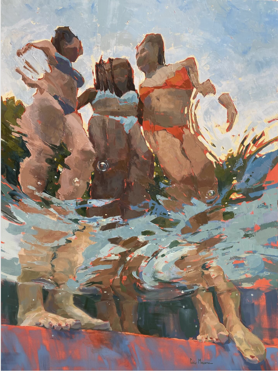
The second I found via Twitter (as usual). I call the motif - bathers. There is something inherently organic and romantic about the water. People love to be by the ocean, as something sublime. You immerse yourself in water, you are ultimately powerless to it. And yet it has a luxurious lightness to it. Just a splash. You've changed your environment. So it has this really interesting duality. Both extremely calm to float there, and extremely terrifying to be pulled out to sea.
I love then how there are many ways of exploring this visually. On the left image, you see again the use of stroke. But stroke here does not convey movement, so much as the static state of the ocean itself - many many equilibria of waves in unison. The use of colour is lovely too - the surfers, contrasted in orange, against the blue - and the transparency conveyed THROUGH SHAPE! This I find amazing - observe how we see from beneath the water - we can see the clear outlines of the surfers legs and board - but above the water, their bodies are blurred.
What an interesting way to do so?
Contrast this with the image on the right, which is a very realist rendering of transparency and how water diffracts light. In of itself, I have always found this to be something mesmerizing. The distortion of what appears to be size and form as we see from under the water and upwards to the girl's legs reminds me of the spacetime curve, as mass/gravity distorts time.
How interesting is it also that we are seeing this image from the feet-up (maybe Tarantino was behind this?). I rarely see water portrayed this way. In the top-right, you see the emboss of bright orange sunlight, a colour reminiscent of the 3-5pm glow. How interesting is it that you could tell time from only colour? This is deduction.
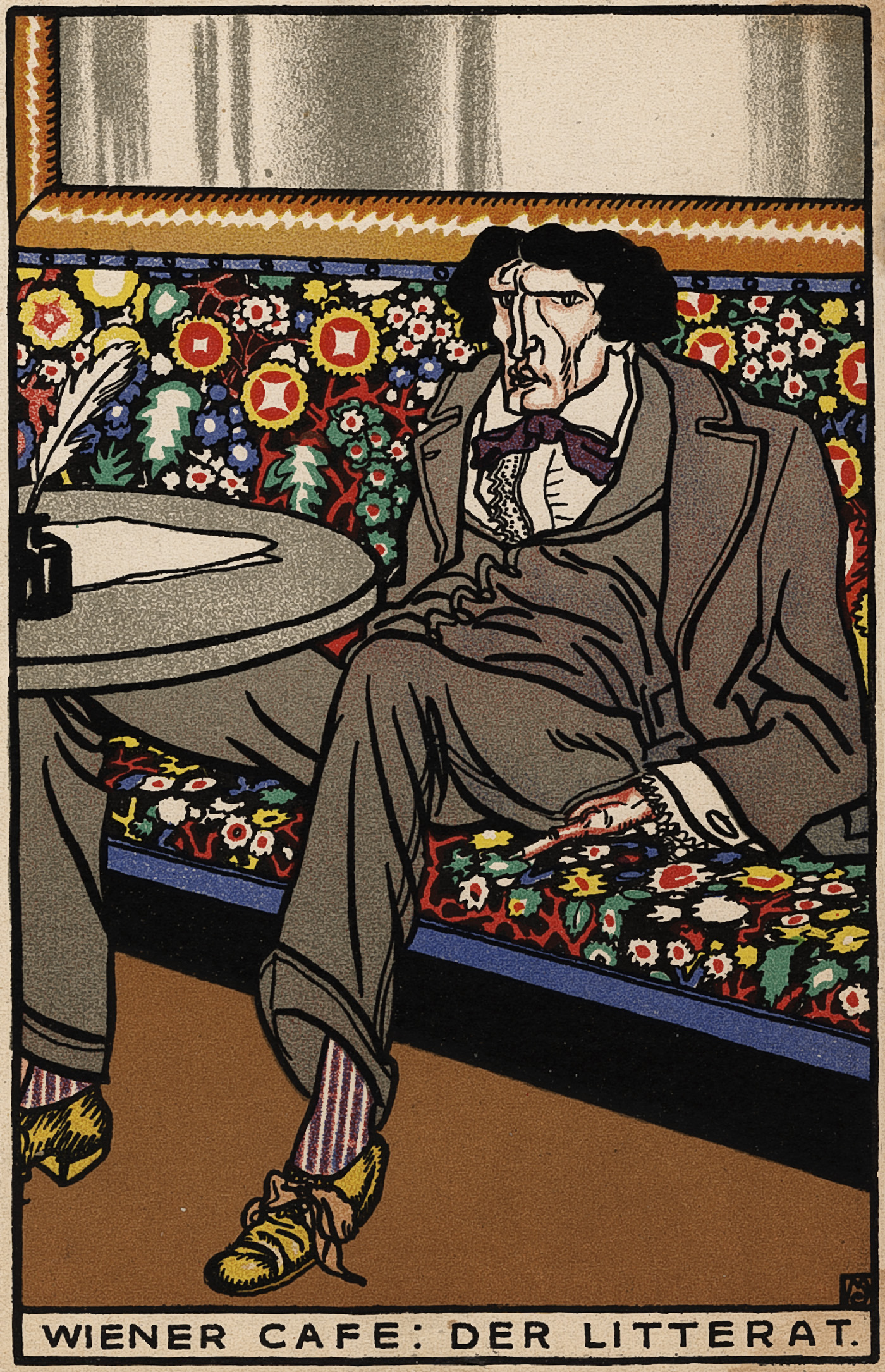
I like this one just because it's silly. Hahahhaha. The laggard almost-destitute businessman perched against a backdrop of glittering tiny colours. It feels cute in a way which is girly (because I think girly culture is inherently based on cuteness). It's just funny to me hahahaha. He looks so comfortable, I've been in this position.
I labelled this "Dollop Brushstroke" 1) because I like the word dollop and was laughing the other day at how inherently constrained that word is to only being used in situations with paint, milk, or basically butter and 2) I love how chunky this is. To be honest, I like the left more than the right - it captures a remarkable amount of detail in a very crusty texture. But the right is nice too.
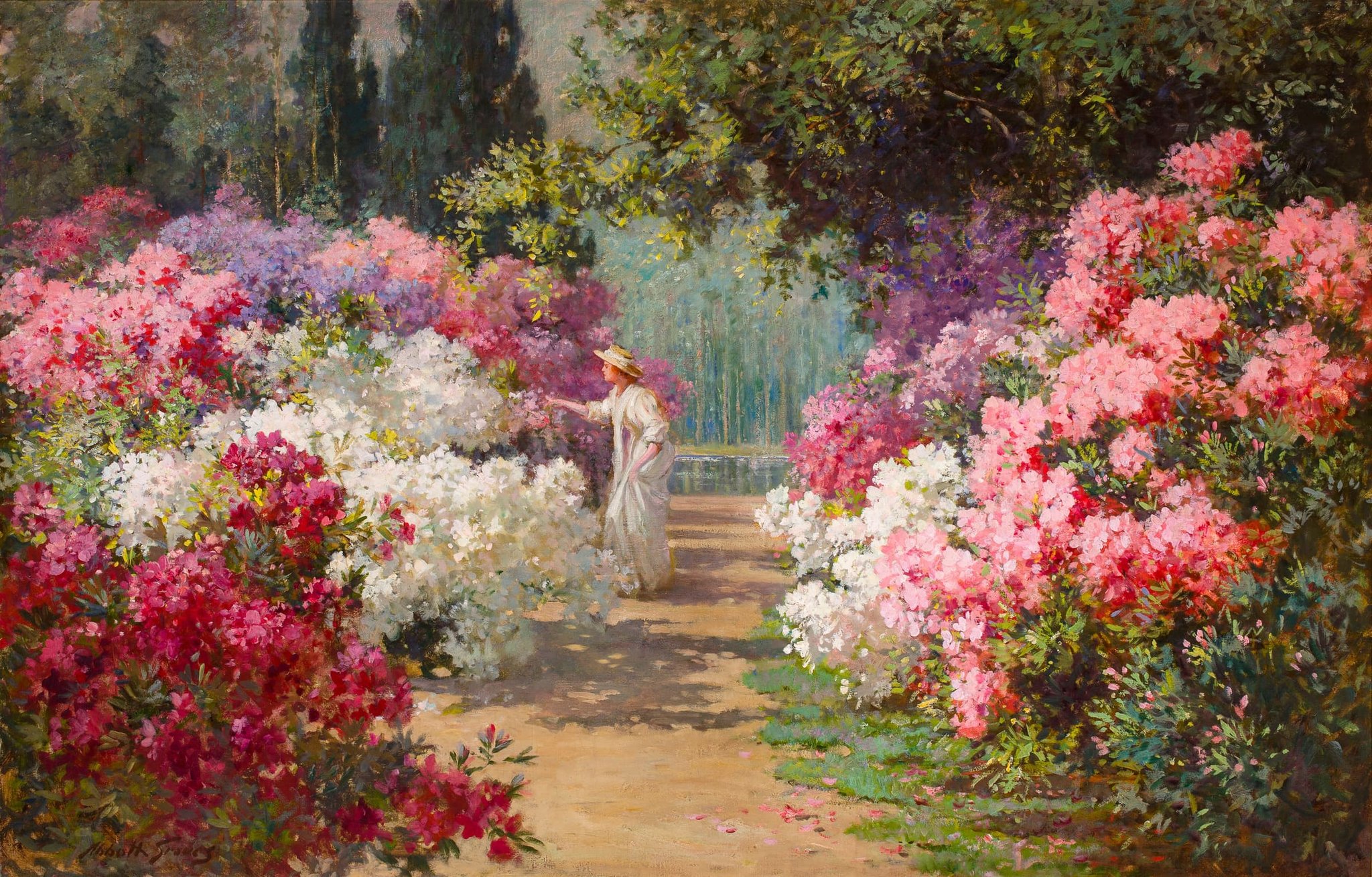
I liked this because it was very pretty. The colours are bright and sensual and feel Rococo. It feels very delicate.
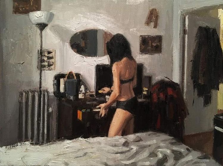
I liked this because it was cool. The girl is hot and the subject is contemporaneous despite the style is not. What's more is this does not seem performative, which everything is in 2026, which made it feel even cooler. I don't know how this was made, if it was painted or generated using AI. But either way it seemed interesting.
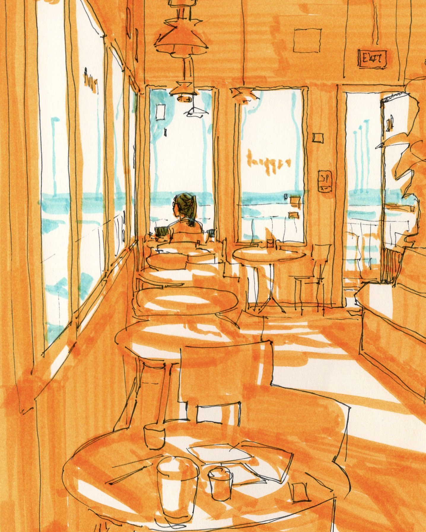
I think this is one of my FAVOURITE artworks of 2026. I just love the colour orange. It is the most vibrant colour to me. Orange represents the most familiar wavelength of light we encounter - sunlight - and this is why this image is so interesting. It is a cafe bathing in sunlight. It is uniquely overloaded with orange, everywhere except the windows, implying the interior is warmth and the exterior is colder. It has an energetic, vibrant stance that is paired with maybe a sense of cozyness/hygge/gezzeligheid.
Aside from this, I just loved how it was drawn. It seems drawn - thin black strokes, which wobble and quaver. It is interesting how the thinness of a stroke can imply precision (see: technical drawings), but the path it takes can also convey flexibility.